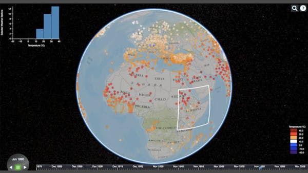
Explore Thousands of Weather Stations and a Century of Weather Data with NASA Weather Station Visualizer
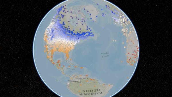
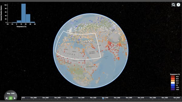
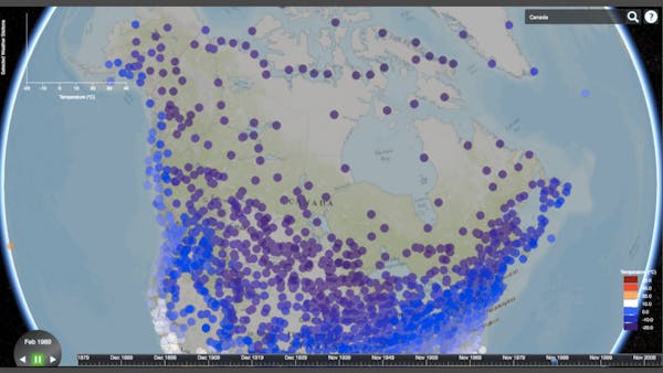
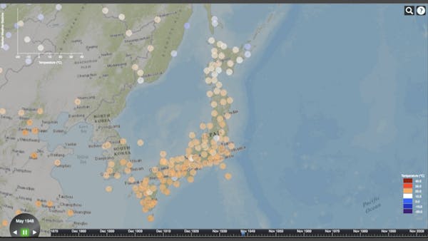
The NASA Weather Station Visualizer gives a raw display of temperature data used to calculate climate change. Weather stations show colors corresponding to the monthly average temperature they recorded. Advancing the timeline changes the colors in response to changing global temperatures.
The NASA Weather Station Visualizer was developed by Allen Koren with his advisor Zoë Wood at Cal Poly, San Luis Obispo as part of a Master’s thesis. The full thesis tests the effects of latency on understanding a dataset in a 3D interactive data visualization. The results are detailed in the published thesis.
Several performance optimizations help keep the visualization responsive for analytics tasks. A spatial hash data structure groups weather stations into approximate buckets, which speeds up location lookups. This speeds up the histogram selection tool and culling stations outside of the camera’s view frame. Also, JavaScript objects storing color and time properties are allocated only once and are constantly reused. This removes major garbage collection events that pause the whole visualization.
The visualization uses the Cesium timeline and billboards to show the weather stations. The histogram and legend are created in D3 and overlaid onto the Cesium interface.
The temperature data fails to show climate change since it’s in a raw form. All global warming data visualizations show temperature changes relative to a base period—usually between 1951 and 1980. Further normalization and binning steps are detailed by NASA.